
The Persistence of Hot Metal in the Digital Age
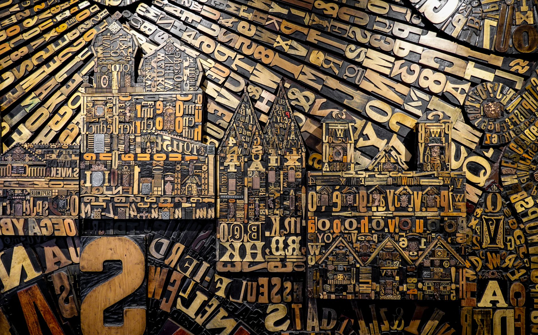
In the heart of Saxony, where Central Europe’s trade routes have converged for centuries, the press has never stopped beating. Leipzig, historically recognized as Germany’s capital of books and publishing, harbors a material resistance in its quiet alleys and industrial courtyards that defies the dictatorship of the screen. Here, lead, antimony, and tin continue to be melted at precise temperatures in crucibles that demand both craftsmanship and devotion. This is no nostalgic exercise reserved for bibliophiles, but a living ecosystem where contemporary typographic design dialogues directly with the secular techniques of movable type casting.
The traveler who crosses the threshold of these workshops immediately perceives an unmistakable aroma: a dense blend of mineral oil, tempered metal, and freshly pressed cotton paper. In these spaces, time seems to fold back on itself. Linotype machines and Heidelberg platen presses are not mere museum pieces, but precision instruments that continue to carve human thought in relief. The question running through this territory is as urgent as it is complex: how does the materiality of the sign survive in a world dominated by digital intangibility? The answer is sculpted stroke by stroke onto the tempered steel punch.
The Origin of the Form: The Art of Punchcutting
Every printed alphabet is born from a tiny gesture invisible to the ordinary reader: the cutting of the punch. In the workshops of the Plagwitz district, the continent’s last punchcutters work under the zenithal light of halogen lamps, using high-magnification loupes and specialized steel gravers. Each capital letter is a miniature sculpture carved in relief on a square-section metal rod. A fraction-of-a-millimeter error in stroke modulation or profile contrast will completely ruin the legibility of an entire typographic body when multiplied thousands of times across the page.
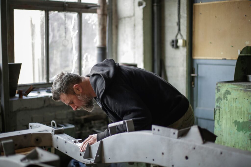
This process demands absolute mastery of visual geometry and typographic optics. Masters do not rely solely on digital calipers; they trust the tactile memory accumulated over decades of apprenticeship. The finished punch is struck with controlled force into a softer copper block to generate the matrix. This matrix, subsequently placed at the bottom of the casting mold, will receive the alloy poured at over three hundred degrees Celsius. It is a ritual of physical transformation where fire gives consistency to thought.
Lead is not a cold material; it retains the memory of the pulse that carved it and transfers it with unrelenting fidelity to the paper.
Typefounding in Leipzig is not an isolated activity, but the engine of an interdependent network of trades that includes artisanal papermakers, round-spine bookbinders, and manual compositors. Each link in this production chain depends on the precision of the previous one. When a workshop commissions a custom typeface for a bibliophile edition, the design process can stretch for months before the first letter touches the surface of Hungarian or Italian paper.
The Architecture of the Workshop: Between Tradition and Experimental Design
Workspace environments in Leipzig reflect the duality of a city that successfully reinvented itself after the scars of the twentieth century. Former textile warehouses and publishing complexes from the industrial era now house studios where state-of-the-art computers coexist with wooden type cabinets filled with cases. In these rooms, young graphic designers from all over Europe work alongside veteran founders who learned their trade in the former German Democratic Republic, when the state book industry maintained traditional standards of typography.
The coexistence of these two generations has generated a unique aesthetic revival. On one hand, classic typefaces from the Renaissance and the nineteenth century are restored and cataloged, recovering the original designs of historic foundries like Bauer or Schelter & Giesecke. On the other hand, experimentation thrives in the hybrid space between digital vector design and physical relief. Young creators use parametric design software to trace the original curves of a letter before translating them into a numerical control file that mills the matrix in hard metal.
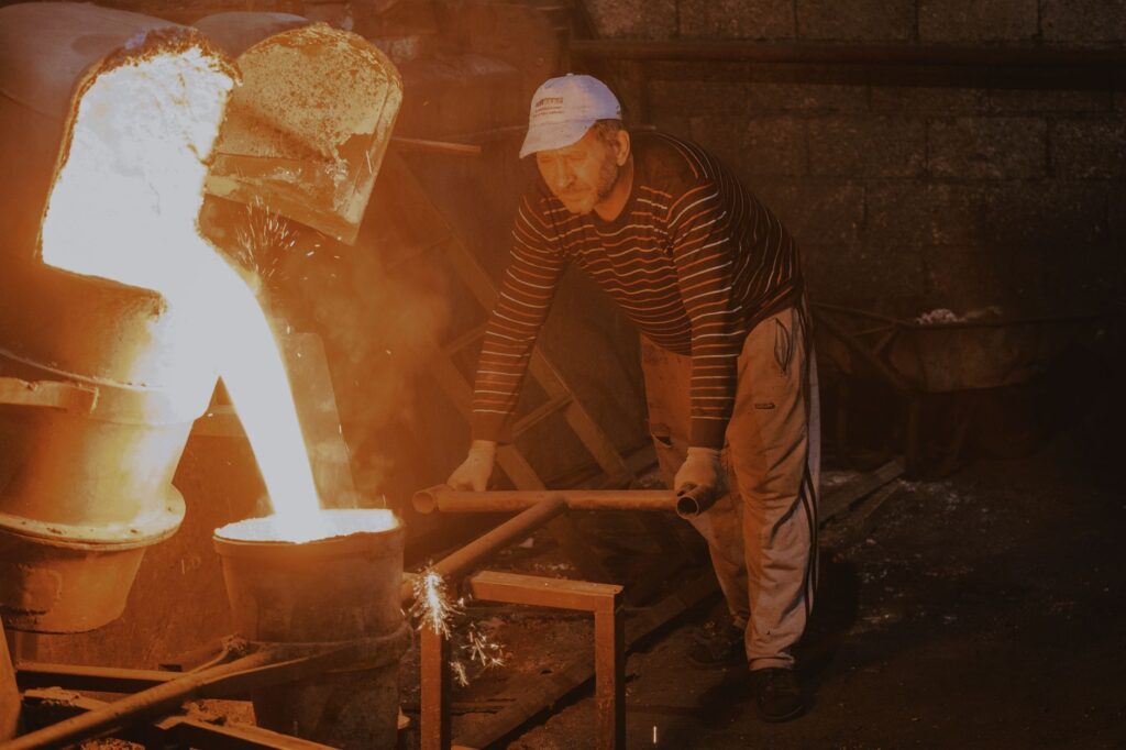
This controlled transition ensures that knowledge is not extinguished, but adapted to modern standards of aesthetic rigor. Visits to these studios reveal that lead typography is not a useless relic, but a reminder that reading is, above all, a bodily experience. The weight of the paper, the resistance of plant fibers, and the deep impression left by the letter biting the substrate establish direct communication between author and reader that no illuminated pixel can replicate.
The Rhythm of the Case: Manual Composition and Negative Space
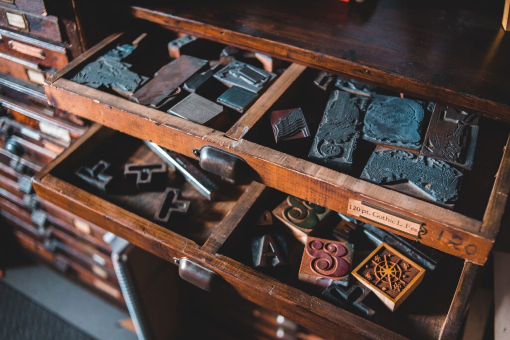
At the operational heart of any typographic workshop lies the setting table. Before it, the compositor selects lead sorts one by one from the cases, rigorously ordered according to the usage and frequency of each character. This seemingly mechanical work requires absolute concentration and a deep understanding of typographic whites: word spaces, leading, and margins that structure the text block.
Manual composition teaches contemporary designers the value of visual silence. On screen, empty space is an accident or available background; in the type case, space is a physical presence constructed using wooden or alloy tiles known as furniture and spacing material. Each line is locked with millimeter precision using wooden wedges and iron side-sticks so the form is perfectly secured before entering the press. If a single wedge gives way under pressure, the mold will collapse into a thousand pieces during the print run, an accident known in the trade as a pi or type spill.
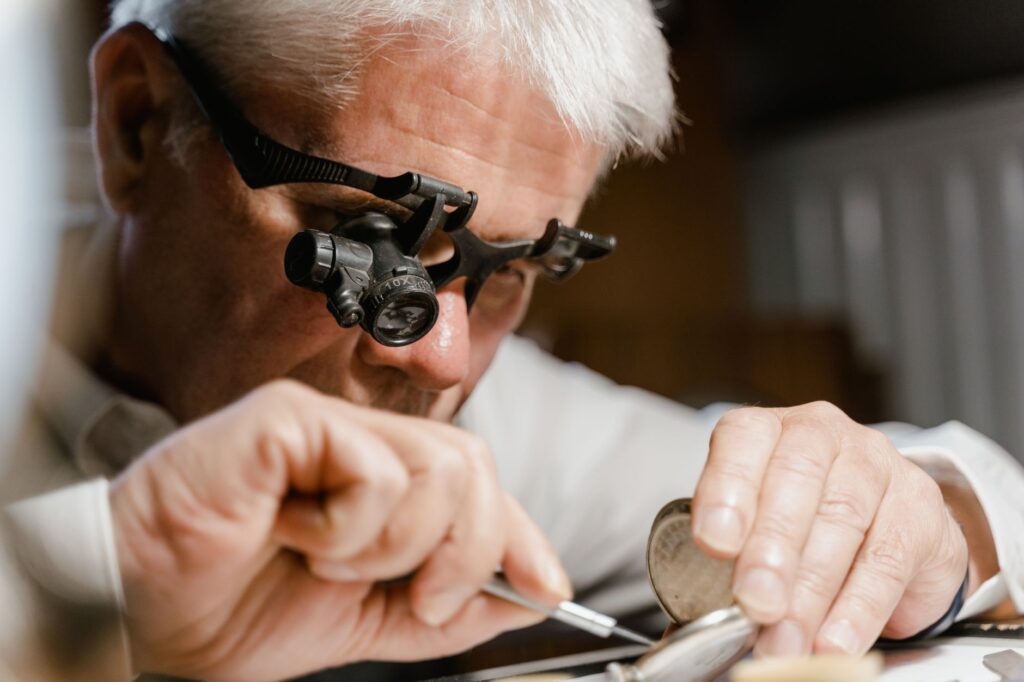
Manual selection of characters according to body size and typographic family.
Leveling of the line using lead spaces and interlinear strips.
Locking of the form in the chase using mechanical tightening wedges.
Tactile verification of iron height using a micrometric rule.
This technical rigor contrasts sharply with the speed of current digital publishing, where layout is modified with a single click. The slowness imposed by hot metal forces reflection on every word, turning writing into an architectural act where nothing can be left to chance. Editors who choose this path understand that the durability of a work depends as much on the solidity of its arguments as on the integrity of its material support.
Practical guide
Visiting Leipzig’s typographic workshops and studios requires planning and respect for the working schedules of master artisans, whose days are dedicated to producing specialized commissions.
Getting There and Getting Around the City
Leipzig boasts excellent rail connections from Berlin and Frankfurt via the ICE network. Leipzig/Halle Airport offers international flights and direct train connections that bring travelers to the central station in just fifteen minutes. To navigate industrial districts like Plagwitz or Lindenau, where most typographic studios are concentrated, the LVB tram network is the most efficient and sustainable option.
When to Visit and How to Plan Appointments
The best time to tour the workshops encompasses the spring and autumn months, avoiding the heart of winter and the intense summer heat in unconditioned industrial spaces. Most workshops do not function as museums open to the general public, making it essential to request appointments in writing several weeks in advance. Events like the annual Leipziger Buchmesse or open-house days for Saxon graphic design offer excellent opportunities to access spaces usually closed to conventional tourism.
Recommended Accommodations and Codes of Conduct
Staying in the historic district or in revitalized areas like Plagwitz, where former industrial buildings have been transformed into minimalist boutique hotels, is strongly recommended. During workshop visits, following the safety instructions given by the masters is mandatory: avoid touching hot matrices, do not operate machinery in motion, and maintain a prudent distance from the acids used in chemical engraving.
The Final Beating of Printed Paper
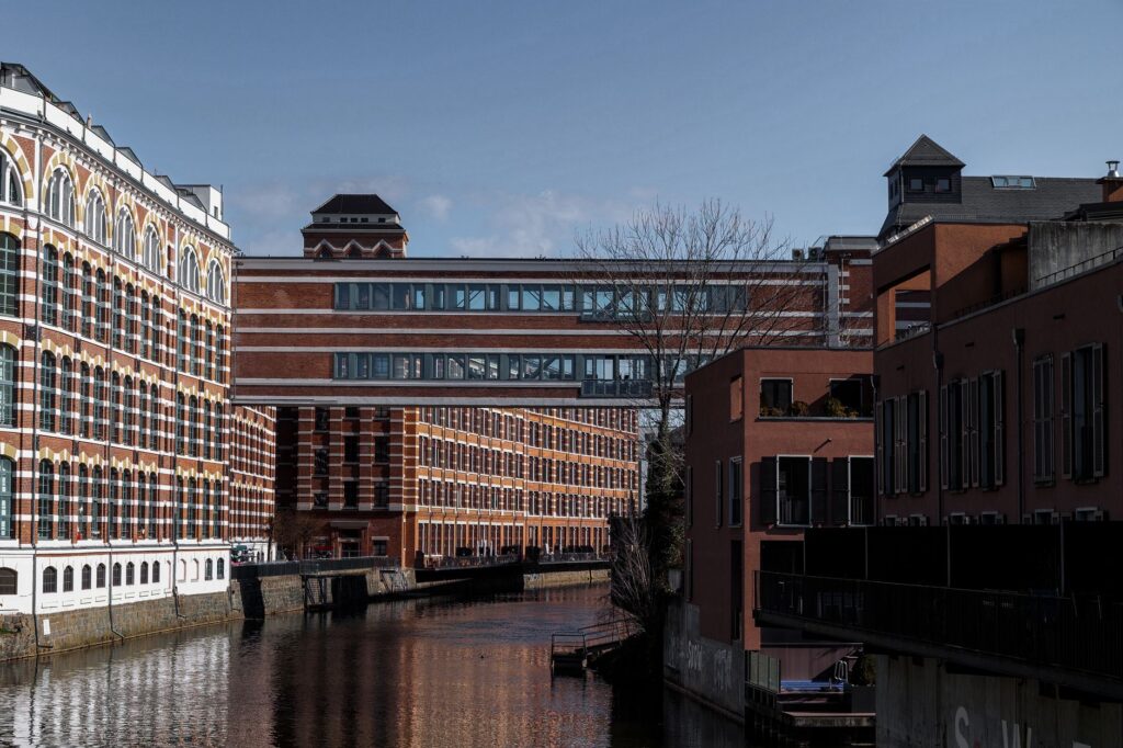
When evening falls over Leipzig’s industrial canals and the lights of the workshops begin to reflect on the dark water, the metallic echo of tweezers and the dry thud of the presses still resound inside the studios. There, a young printer runs their fingertips over the surface of a freshly pulled sheet, verifying that the ink has distributed with exact pressure. That silent gesture encapsulates the raison d’être of this ancient trade: the certainty that ideas, to truly transcend time, must anchor themselves in matter and resist oblivion with the unyielding dignity of lead and fire.