The Secret Capital of European Printing
Leipzig has maintained a symbiotic relationship with the written word for centuries. Very few cities on the European continent can boast of having woven their urban architecture, economy, and cultural identity around the noble and heavy craft of casting lead, tracing matrices, and arranging movable types in wooden cases. While other metropolises quickly succumbed to digital modernization and the systematic abandonment of traditional graphic trades, this Saxon city has guarded with an almost clandestine fervor the knowledge inherited from Johannes Gutenberg and the great typographic foundries of the 19th and 20th centuries.
Strolling through the historic neighborhoods of Leipzig requires a keen eye for the architectural details that reveal its publishing past. The facades of former paper warehouses and centuries-old printing shops still display stone carvings, capitals featuring printing press motifs, and the names of publishers who once dictated the intellectual pulse of Central Europe. In this geographical context, lead typography is not viewed simply as an archaeological vestige or a museum curiosity meant for nostalgic tourism, but as a living language that continues to express aesthetic and tactile nuances impossible to replicate through an illuminated screen.
The Workshop and the Matter: The Metal Alphabet
Crossing the threshold of an active typographic workshop in Leipzig is to step into a universe dominated by the dense scent of linseed oil, paraffin, and molten metal alloy. Inside these studios, time seems governed by a different mechanical beat. Master founders operate with tools that have undergone virtually no substantial modifications in two hundred years: crucibles where lead, antimony, and tin are melted at precise temperatures, micrometer-adjusted molds, and delicate steel tweezers used to extract hot type with an almost choreographic agility.
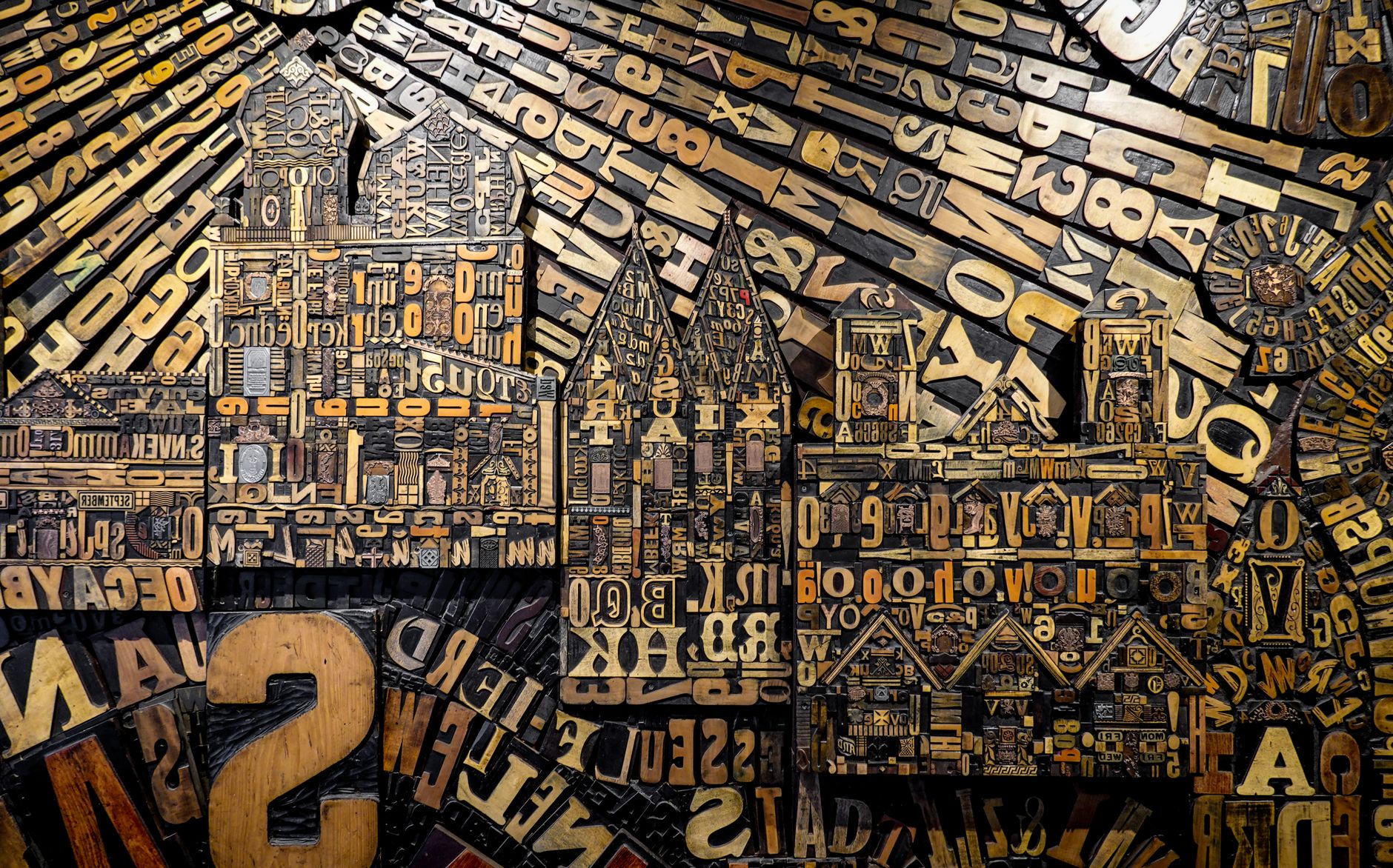
Each letter of the alphabet is the result of a micrometric casting process that begins with the manual design of the original punch. This piece of tempered steel, carved with infinite patience under a magnifying glass, is struck against a copper block to generate the matrix. It is in this minute relief that the true magic of letterpress printing resides: the ability to transfer a human, imperfect, and warm stroke to a metal alloy destined to strike paper thousands of times. The workshop shelves are lined with cases filled with California job cases, where thousands of compartments meticulously store each character, ligature, and punctuation mark, patiently awaiting the moment to be hand-set.
Lead is not a cold material; it is a metallic skin capable of retaining the exact pressure of human thought before transferring it to paper.
The pace of work in these workshops is grounded in conscious repetition and a profound understanding of the resistance of materials. Journeymen and apprentices check the height of each type using specialized gauges, knowing that a variation of just a fraction of a millimeter would ruin the uniformity of the print. This technical rigor stands in stark contrast to the breakneck speed of contemporary communication, proving that artisanal excellence requires deliberate pauses and absolute respect for the physical rhythms of matter.
Hand Composition: The Art of the Exact Distance
Once the types are cast, the work moves to the composing table. Here, the typographer becomes a spatial architect whose main tools are the composing stick, spaces, and leads. Unlike modern desktop publishing programs, where letter spacing is calculated through automated algorithms, in the artisanal workshop the human eye and fingertips dictate the exact distance that must exist between two characters so that the reader’s eye travels smoothly and naturally along the line.
This process of manual justification demands absolute mastery of orthotypography and refined aesthetic sensitivity. Each character is placed from right to left, inverted in the mirror of the composing stick, building lines that are subsequently grouped into galleys and locked firmly inside an iron frame known as a chase. The typographer’s skill lies in balancing the white of the page with the density of the black text, understanding that margins and blank spaces are just as important for legibility as the printed letters themselves. It is a constant dialogue between the strict geometry of the typecase and the artisan’s visual intuition.
Today, this working method attracts a new generation of graphic designers, visual artists, and independent publishers who come to Leipzig to unlearn the automatisms of the digital screen. In these shared studios, the physical limitation of available type inventory transforms into a radical creative stimulus. Unable to resort to hundreds of digital font families with a single click, creators must delve deeply into the expressive virtues of a single typeface family, discovering subtleties in contrast, metal wear, and ink texture that profoundly enrich their editorial work.
Cylinder Presses and Platens: The Dance of Pressure
The climax of the graphic process takes place in the printing area, where imposing flatbed presses, automatic platen presses, and robust cylinder machines from historic brands like Heidelberg or Vandercook stand side by side. These masses of cast iron, meticulously maintained by specialized mechanics who manufacture their own replacement parts, execute a perfectly synchronized choreography every time the operator engages the pedal or start button. The ink fountain distributes a uniform layer of pigment over the rubber rollers, which in turn gently ink the relief of the typographic form.
The moment paper comes into contact with the inked metal under controlled pressure constitutes an unrepeatable sensory experience. Cotton paper, slightly dampened beforehand so the fibers absorb the ink with greater ductility, receives the exact bite of the type, generating a subtle debossed relief on the reverse side that is the unmistakable hallmark of authentic letterpress printing. This is not a perfectly flat, two-dimensional surface, but a tactile landscape where text acquires volume, body, and a resounding physical presence that inexorably invites touch.
Leipzig printers insist that the secret to a successful run lies not solely in the quality of the machinery, but in the finesse of makeready adjustments. Each piece of type worn by decades of use imparts a unique character, a minor irregularity that contemporary studios do not conceal, but rather celebrate as undisputed proof of authenticity. This material honesty contrasts with the sterile perfection of the digital age, connecting the modern reader with a tradition where every book or broadside is an unrepeatable object, imbued with the physical effort and manual skill of those who made it possible.
The Living Archive and Cultural Resistance
Leipzig would not be the undisputed capital of typographic culture in Germany without its conservation institutions and specialized archives, which function as guardians of European graphic memory. Places like the Museum of Printing and the Art of Graphic Arts house monumental collections ranging from 18th-century wooden presses to complex linotype machines, alongside thousands of original punches and historical specimen books from long-defunct foundries. These spaces do not operate as cemeteries for obsolete machinery, but as active training centers where international workshops in printmaking, casting, and typography are held.
The work of these centers is essential to guarantee generational handover. Young people from all over the world arrive in Leipzig for educational residencies, learning directly from retired master craftsmen who dedicate their final working years to passing on knowledge that printed manuals barely touch upon superficially. This transfer of tacit knowledge — the exact touch required to loosen a quoine, the precise ink density to avoid smudging, the attuned ear to the sound of the press — constitutes an intangible heritage of incalculable value that tenaciously resists the planned obsolescence of the technological era.
The typographic archive does not preserve inert objects; it sustains the pulse of a community that refuses to forget how the voice of matter sounds.
Likewise, annual festivals and international gatherings of independent publishers have turned the Saxon city into a global reference point for bibliophiles and creators seeking alternatives to the mass commercial circuit. At these events, artisanal publications printed in small runs are exhibited and traded face-to-face, fostering a human-scale economy where the value of a book is measured by the time invested in its creation, the nobility of the materials used, and the rigorous care given to textual and visual contents.
Practical Guide
Planning a cultural trip to Leipzig focused on typographic heritage and graphic arts requires knowing key locations and the ideal times to access active artisan workshops.
- How to get there: Leipzig/Halle Airport offers excellent direct rail connections with Berlin and Frankfurt. From Leipzig Central Station (Leipzig Hauptbahnhof), the tram network efficiently connects to major historic districts and cultural centers.
- When to visit: Spring and autumn are ideal months for exploring the city on foot. It is recommended to time your visit to coincide with the Leipzig Book Fair in spring or the open doors days of graphic workshops held in October.
- Must-sees: The Museum of Printing and the Art of Graphic Arts (Museum für Druckkunst) in the Plagwitz district is an essential stop. It is advisable to book specialized guided tours in advance, which include hot metal type casting demonstrations.
- Workshops and studios: Numerous independent studios in the Lindenau and Plagwitz districts welcome visitors by appointment. It is recommended to contact artists directly through their digital platforms to coordinate personalized demonstrations of hand composition and platen printing.
- Accommodation: The city’s western creative districts offer small boutique hotels and design apartments integrated into rehabilitated former industrial warehouses, respecting the industrial aesthetics of the local publishing tradition.
The Echo of Lead in the 21st Century
At the end of the day, when the golden light of the Saxon sunset begins to filter through the thick glass windows of the workshops, the typographers meticulously clean the metal forms with vegetable solvents and return each character to its corresponding compartment with an almost meditative precision. In that silent gesture lies the definitive answer regarding the relevance of this ancient craft. In a world saturated with ephemeral content, digital noise, and fleeting visual stimuli, lead typography in Leipzig stands as a sanctuary of permanence, a tangible reminder that beauty and deep thought require matter, time, and hands to endure in humanity’s collective memory.