

The Persistence of Movable Type in the Digital Age
In the heart of Antwerp, where the echoes of the Rhine and the Scheldt still carry the ghosts of Christophe Plantin and Jan Moretus, artisanal printing enjoys a season of quiet resistance. Far from being a nostalgic exercise or a mere museum piece, the typographical workshops of the Flemish city operate as high-precision laboratories where lead, boxwood, and linseed oil merge in an uninterrupted dialogue that defies the velocity of the screen.
The question underpinning this renaissance is not how to compete with the immediacy of electronic media, but what ontological value the written word acquires when subjected to the physical weight of the press. Each letter is a three-dimensional body that bites into the cotton paper, leaving tangible grooves that no pixel can ever replicate. This technical rigor demands an almost monastic patience, where an error of a single millimeter in aligning the composing stick condemns hours of meticulous work back to the melting pot.
Manual printing is not a refuge from the present, but an active archaeology that reminds us reading is, above all, a physical act of friction between the hand and the matter.
Today’s masters of this craft are not collectors of antiquities, but heirs to a chain of knowledge transmission that nearly vanished during the final decades of the twentieth century, when photocomposition swept away traditional workshops. Today, young typographers emerging from contemporary graphic design flock to Antwerp to learn the trade from its most elementary gesture: emptying type cases and feeling the precise touch of the tweezers.
The Alchemy of the Workshop: Alloys and Substrates
The process begins in the type foundry, a space where the scent of hot lead and wax dominates the atmosphere. The traditional alloy, composed of a precise mixture of lead, antimony, and tin, must reach an exact temperature so the liquid metal flows through the matrix channel without leaving bubbles or imperfections in the letter’s eye. A single degree too much ruins the alloy; a degree too little produces a fragile character that crumbles under the press’s weight.
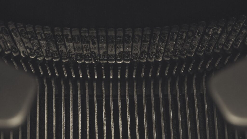
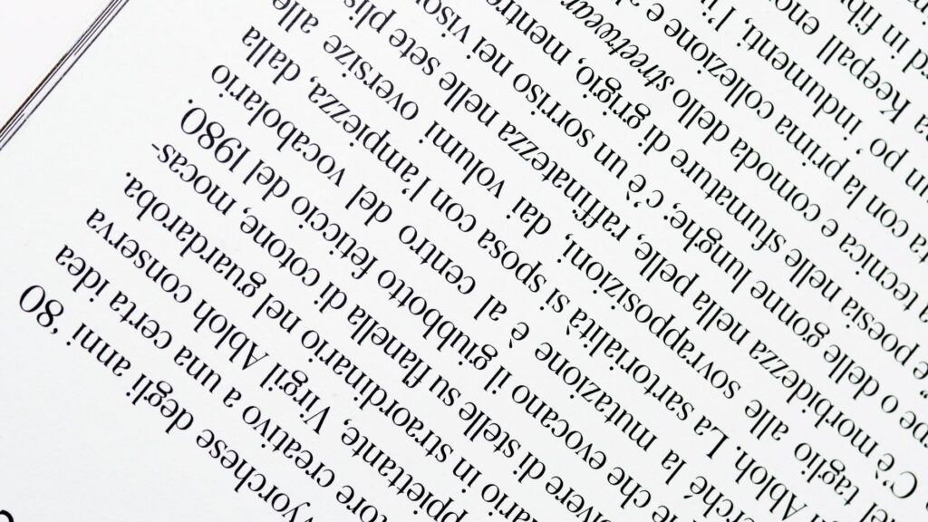
A few meters from the melting pots stand the type cases, laid out according to the secular usage of caps and small caps. Antwerp’s typographers work standing up, with a rhythmic cadence reminiscent of a ritual dance. In their left hand, they hold the brass composing stick, while with the right they select characters at astonishing speed, mentally inverting the reading order to compose lines from right to left and upside down.
This spatial mastery of written language is one of the hardest skills to acquire. It requires cognitive training that transforms syntax into pure geometry. Once the galley is full, it is secured with a furniture lock and transferred to the imposition table, where the text is locked into place using wooden wedges known as quoins, ensuring not a single letter shifts a fraction during printing.
The Pulse of the Press: Pressure and Paper
If composition is the skeleton of the work, the press is its circulatory system. Antwerp’s workshops are dominated by nineteenth-century iron presses, such as the celebrated Columbian and Albion models—veritable cast-iron sculptures adorned with floral motifs and mythological allegories that combine industrial might with the delicacy of a surgical instrument.
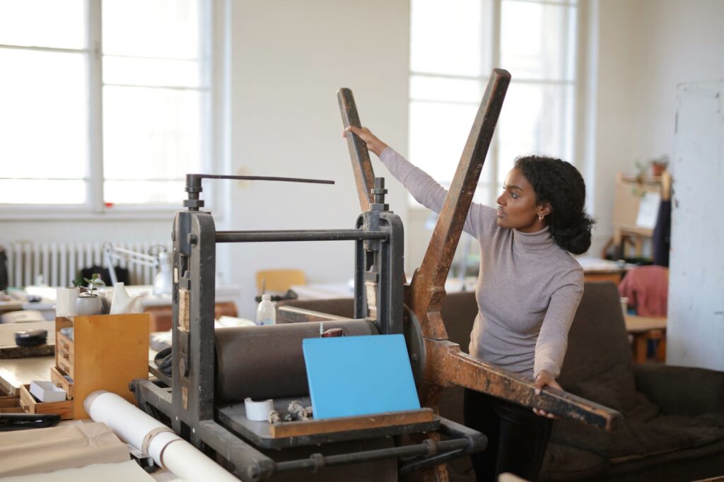
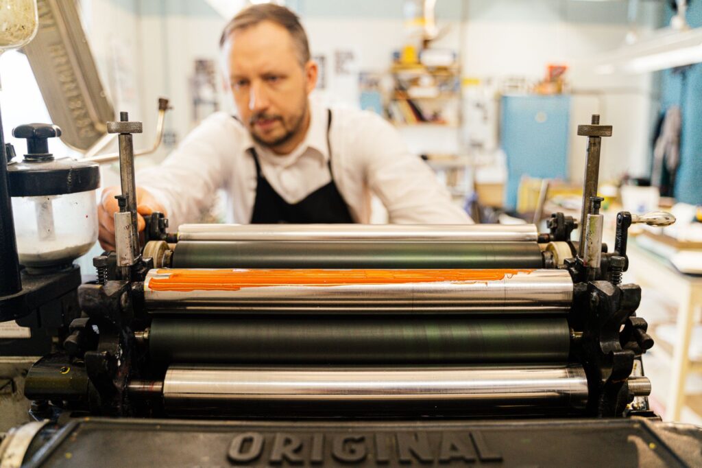
The paper used is never a neutral support; it is a fundamental actor in the final result. Artisanal vat-made papers composed of cotton and linen fibers, acid-free and pre-dampened, allow the fibers to relax and accept the deep penetration of typographical ink. This ink, made from vegetable oils and dense mineral pigments, possesses an unctuous consistency akin to bitumen, requiring even distribution across the plate using natural rubber or gelatin rollers.
When the printer pulls the press lever, the heavy platen descends with a dry, muffled thud. That sound marks the exact moment memory is indelibly fixed in the cellulose. Lifting the frisket and gently pulling back the sheet reveals the proof: a three-dimensional relief where the black ink shines with a satin finish that shifts with the incidence of light.
Typographical Architecture and Living Heritage
Antwerp’s urban landscape maintains a tight-knit relationship with this publishing tradition. The Plantin-Moretus Museum, designated a UNESCO World Heritage site, is not merely a mausoleum of Renaissance printing but the lighthouse guiding today’s workshops. Its archives house thousands of original steel punches and copper matrices used to print the works of sixteenth-century humanists.
Contemporary artisans in the city maintain a symbiotic relationship with this institution. They frequently consult historical collections to study the proportions of letterforms created by Robert Granjon or Claude Garamond, reinterpreting them through digital tools before cutting or casting them in metal anew. This bridge thrown between the sixteenth and twenty-first centuries proves typographical art is not a cultural fossil, but a constantly evolving language.

The workshops are discreetly distributed across the city’s historic quarters, from the port district of Eilandje to the winding alleys surrounding Antwerp Cathedral. In these spaces, natural light floods through large north-facing windows—the only way to prevent sunlight reflections from distorting the reading of texts mid-composition.
The Resilience of Book Arts
The renaissance of manual printing in Antwerp forms part of a broader European movement reclaiming slow culture against planned obsolescence. Yet in the Flemish capital, this phenomenon acquires a unique nuance due to its historical weight. Here was born the Western world’s first major publishing enterprise, and that memory weighs like an ethical responsibility upon the shoulders of current printers.
The economic sustainability of these workshops relies on short-run art editions, artist books, bespoke posters, and commissions for international bibliophiles seeking unique artifacts. Each copy is accompanied by a detailed colophon specifying paper stock, serial number, alloy provenance, and the names of both compositor and pressman, reclaiming individual authorship in a world dominated by industrial anonymity.
The hand-printed book is palpable proof that written culture requires bodies and weight to keep from evaporating into the abstraction of digital networks.
This reduced scale allows workshops to maintain creative independence. They depend neither on huge print runs nor mass distribution; their commercial network relies on direct trust, specialized antiquarian book fairs, and collaborations with poets, printmakers, and visual artists who value the honesty of the typographic medium.
Practical guide
How to get there: Brussels Airport (BRU) lies about 45 kilometers from Antwerp. Direct trains to Antwerp Central Station (Antwerpen-Centraal) depart from the airport railway terminal every twenty minutes, taking approximately 30 minutes. It is also possible to fly into Antwerp-Deurne Airport (ANR), though commercial flight connections are more limited.
When to visit: Spring (April to June) and autumn (September to November) offer optimal temperatures for walking the historic center without summer crowds. Many typographical workshops host open-door days and live demonstrations during cultural weekends organized by the city council in October.
Workshops and points of interest:
- Plantin-Moretus Museum: Essential for understanding the origins of modern typography, housing the world’s oldest surviving printing presses in working order. Advance ticket reservation on their official website is strongly advised.
- Atelier De Artefact: Located in the Eilandje district, this contemporary studio offers type-casting demonstrations and short hot-metal composition courses.
- Letterpress Antwerp: A studio specializing in artistic poster design and artisanal bookbinding, welcoming professionals and researchers by appointment.
- Plein Publiek: An alternative cultural hub that frequently hosts temporary exhibitions dedicated to graphic design and traditional book crafts in Antwerp.
Designer accommodation: For a complete immersion in the city’s creative atmosphere, Hotel Julien offers minimalist design within two 16th-century historic townhouses in the old town, while designer apartments in the Zurenborg district—renowned for its Art Nouveau architecture—provide an exceptional neighborhood stay.
Epilogue: The Echo of the Last Line
When dusk falls over Antwerp and trams rhythmically cross the cobbled squares, work inside the typographical workshops never truly stops. Printers clean the press rollers with turpentine, clearing away traces of black ink that shaped the day’s pages. It is a routine, almost meditative gesture repeated uninterrupted for five hundred years.
In that laborious silence lies the true victory of manual printing. It is not about stopping time, but inhabiting it with a different density. As long as there are hands willing to stain themselves with lead and oil to fix words onto cotton paper, written memory will continue to beat with its own steady, human, and unyielding pulse against the vertigo of liquid modernity.