
Introduction to the Pulse of Ink and Metal
In the heart of industrial neighborhoods converted into cultural districts, from Leipzig to Brooklyn, a dry, methodical, and millenary sound is once again dictating the rhythm of graphic creation. It is neither the frivolous clicking of laptops nor the incessant hum of cloud-storage servers. It is the click of the composing stick, the micrometric adjustment of printing clamps, and the dense smell of linseed oil, molten lead, and damp cotton paper. Relief typography—which Johannes Gutenberg consecrated in Mainz in the mid-fifteenth century and which twentieth-century industrialization ruthlessly cast aside in the name of speed—is experiencing a resurrection today that is as unusual as it is necessary. This phenomenon is neither a folkloric nostalgia nor the ephemeral caprice of vintage curiosity collectors; it represents a profoundly contemporary ideological and aesthetic stance.
When global graphic design has homogenized under the tyranny of liquid grids, retina screens, and endless catalogs of free digital fonts, the pure materiality of movable type offers a radical counterweight. Each letter is a three-dimensional rectangular block of metallic alloy—lead, antimony, and tin—possessing physical weight, temperature, and intrinsic resistance. Writing with metal demands thinking before acting. A typo is not erased with a keyboard command; rather, it requires dismantling the line, checking the type castle, and recomposing the galley with monastic patience. This material friction is precisely the antidote to the visual bulimia characterizing our era, where publication immediacy has devalued the specific weight and hierarchy of words.
The Alchemy of the Workshop: Anatomy of a Contemporary Foundry
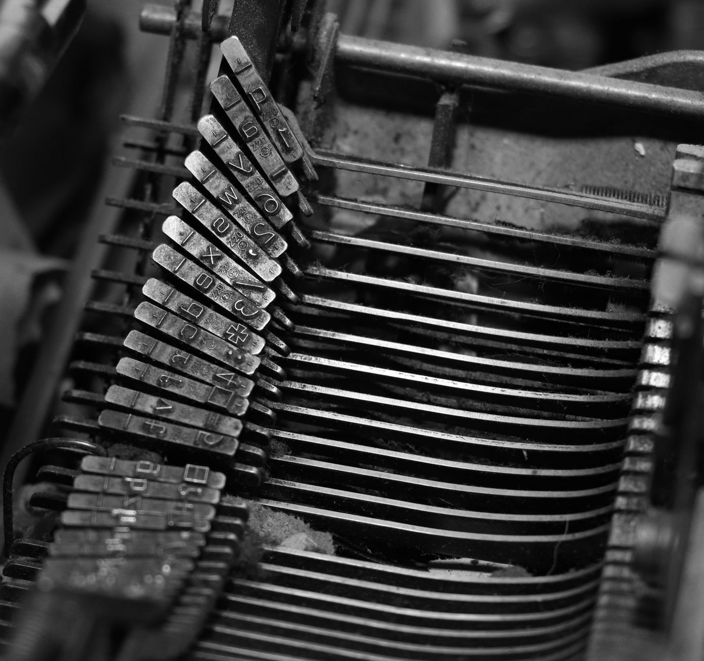
Visiting an active typographic workshop in the twenty-first century is stepping into a laboratory where nineteenth-century physics dialogues with the demands of contemporary author design. Places like the historical St. Gabriel or Stempel foundries, alongside independent workshops operating today in European capitals, preserve irreplaceable industrial heritage. Copper matrices, engraved with steel punches of millimetric precision, are treasures guarded with zealous care. From them, Monotype or Ludlow casting machines transform lead ingots into perfectly calibrated lines of text, ready to be inked and to kiss paper under colossal pressures.
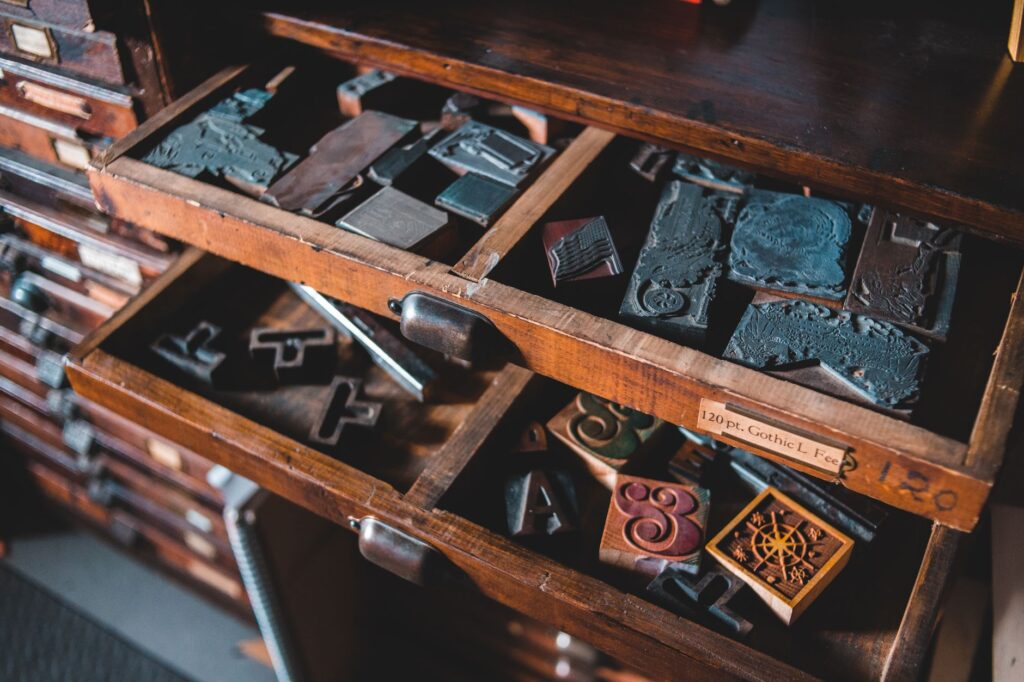
The process demands absolute mastery of materials physics. The melting temperature of lead must hover around 280 degrees Celsius; a degree too high deforms the character, while a degree too low prevents the metal from properly penetrating the corners of the matrix. Contemporary typographers are not mere mechanical operators; they act as restorers of a technical and aesthetic heritage that stood on the brink of definitive extinction during the decades of massive digitalization in the eighties and nineties. Master founders and typographic designers converge today in the same multidisciplinary figure who understands both the subtle modulation of strokes and the thermodynamics of metallic alloys.
Sustainability and Circular Economy in the Typographic Workshop
Against the invisible yet devastating carbon footprint of the digital industry—data centers cooled with millions of liters of water and powered by fossil-fueled electrical grids—traditional typographic printing stands out for its strictly circular economic model. In a well-managed lead workshop, nothing goes to waste. Production surpluses, worn types, and printed text lines not slated for preservation are melted back down in artisanal crucibles to create new ingots ready for future editorial projects.
The paper used typically originates from artisanal mills or European paper mills employing recycled cotton, hemp fibers, or chlorine-free cellulose with rigorous forestry certification. Inks, traditionally based on vegetable oils and natural mineral pigments, eliminate volatile organic compounds harmful to the artisans’ health and the environment. This material coherence turns contemporary typographic edition into a model of radical sustainability, where the printed object is not a fast-consumption good destined for the bin, but a cultural artifact conceived to endure for generations.
The Living Geography of Artisanal Printing in Europe
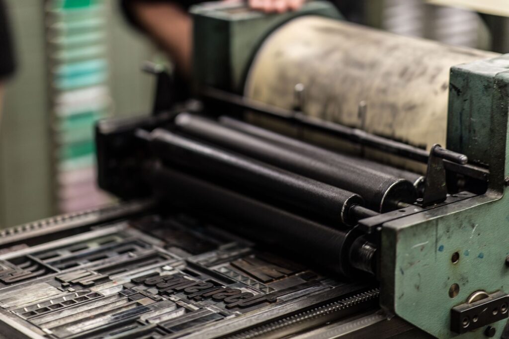
The European map of lead typography traces a fascinating network of cultural resistance. In London, the esteemed St. Bride Library continues to function as the archive and intellectual beacon of graphic trades, while small workshops in the East End print posters and poetry books using Vandercook proofing presses. In Paris, hidden workshops in Marais courtyards keep the tradition of classic French typography alive, linked to historical punch-cutter dynasties. In Barcelona and Madrid, collectives of young designers have rescued old neighborhood printing presses, transforming them into experimental spaces where visual poetry, contemporary poster art, and ultra-limited artists’ books intersect.
These geographies are not static museums; they are vibrant ecosystems attracting graphic designers fatigued by pixel tyranny. Prestigious international art universities in Switzerland, the Netherlands, and Germany have reincorporated the typographic workshop into their core curricula. The pedagogical rationale is incontrovertible: a student who understands the physical resistance of lead and the necessity of calculating space in points and ciceros acquires a spatial and structural comprehension of digital typography vastly superior to those trained exclusively in front of a screen.
Lead tolerates neither haste nor negligence; every printed line is the result of a pact of honor among the typographer, the machine, and the silence of the paper.
The Editorial Market and the Collecting of Object Books
Commercially, limited-run typographic publications occupy a rapidly expanding market niche. Private collectors, university libraries, and bibliophiles worldwide acquire curated editions of poetry, philosophical essays, and art catalogs printed entirely with movable type on high-end papers. These volumes move radically away from the concept of mass-market industrial books. Their value lies in the touch: the deep relief left by the lead type on the sheet—known in the Anglo-Saxon slang as letterpress, yet rooted in the highest European typographic tradition—turns every page into a tactile bas-relief.

The prices of these works reflect the manual labor hours invested, the scarcity of original materials, and technical excellence. A fifty-copy poetry collection, hand-set letter by letter and pressed on a cylinder flatbed machine, can reach prices comparable to original graphic art works. This economic valuation allows independent workshops to maintain financial viability without relying on public subsidies, consolidating a decentralized cultural patronage model directly between creator and collector.
Technical Challenges: Matrix Scarcity and Succession Training
Despite contemporary enthusiasm, the artisanal typography movement faces severe structural hurdles. The primary obstacle lies in the obsolescence and progressive disappearance of heavy casting and composition machinery. Heidelberg Windmill presses, Vandercook proofing presses, and large matrices from historic brands like Deberny & Peignot or Stephenson Blake are no longer manufactured. Keeping them operational requires an invisible army of mechanics specialized in graphic arts, which is dangerously scarce in today’s labor market.

Likewise, the transmission of traditional knowledge risks interruption. Former founders and operators trained in twentieth-century large printing houses are of advanced age. To prevent the loss of this intangible heritage, various European foundations and graphic trade associations are promoting intensive apprenticeship programs, granting scholarships for young designers to reside in traditional workshops and absorb the tacit knowledge absent from printed technical manuals.
Hybrid Typographic Design: When Source Code Embraces Metal
Far from representing a cultural war between an analog past and a digital future, the most advanced workshops on the international scene practice a fascinating hybridization. Many contemporary typographic designers use state-of-the-art vector design software to draw font outlines, yet instead of exporting them solely to .OTF screen formats, they commission polymer matrix manufacturing or laser engraving in zinc to print them mechanically with greasy inks on artisanal paper.
This symbiosis proves digital technology and analog tradition are not mutually exclusive, but complementary. The computer allows experimentation with geometries impossible in the nineteenth century, while typographic printing returns warmth, texture, and corporeality to those digital forms that screens can never replicate. The result is a hybrid visual language enriching both contemporary editorial design and the preservation of artisanal printing techniques.
Practical Information for Visiting and Connecting with Workshops and Typographic Archives
For designers, researchers, or cultural travelers interested in exploring the universe of lead typography, Europe and North America offer first-rate heritage routes and visitability spaces. It is essential to note that the vast majority of these workshops are active production spaces rather than commercial museums, meaning visits usually require prior appointment and, in many cases, an admission fee dedicated to facility maintenance.
- St. Bride Library (London, United Kingdom): The most important typographic archive in the Anglo-Saxon world. Offers specialized consultations by appointment, alongside periodic conferences and workshops on the history of printing.
- Musée de l’Imprimerie et de la Communication Graphique (Lyon, France): A benchmark public institution combining monumental historical collections with live demonstrations of casting and manual typesetting.
- Hamilton Wood Type and Printing Museum (Two Rivers, Wisconsin, USA): The global sanctuary for large-format wood and metal typography, organizing intensive summer workshops open to international creators.
- Independent Spaces in Spain: Workshops such as Pliegos de Papel (Madrid), Recreo (Valencia), or private studios in Barcelona organize weekend workshops introducing the composing stick and manual press. Direct contact through official channels is recommended to check availability and lead-handling safety regulations.
Final Reflection on the Permanence of the Printed Word
In a civilization obsessed with planned obsolescence and the instant consumption of digital content vanishing into the infinite flow of social networks, the persistence of lead typography constitutes an act of poetic and civil resistance. Metal-printed type does not seek to compete with fiber-optic speed; its vocation is precisely the opposite: to stop time. It reminds us that written culture was born from physical effort, patient manipulation of matter, and deep respect for the shape of words.
As long as workshops exist where an artisan adjusts a line of lead with micrometric tweezers to stamp a manifesto on cotton paper, the written word will maintain its ultimate dignity. This is not about rejecting digital modernity, but demanding that design preserve its tactile dimension, historical memory, and capacity to move us through the senses. Lead, cold and heavy in the composing stick, transforms under press pressure into the warmest and most enduring vehicle of human thought.


