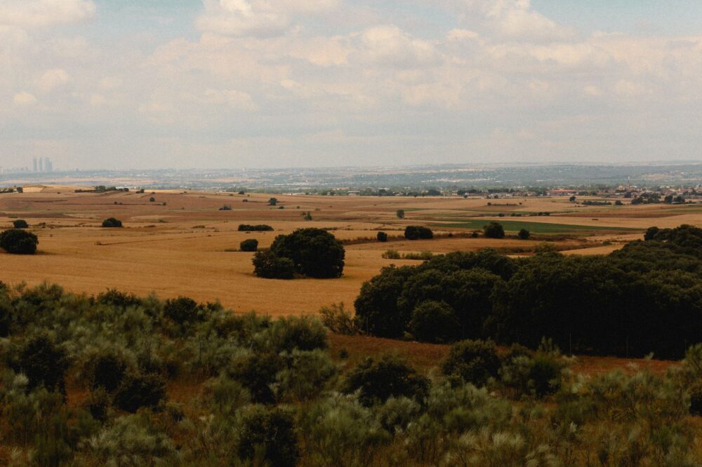


The heartbeat of type in the heart of Emilia-Romagna
Within the urban fabric of Bologna, where medieval porticoes cast a perennial shadow over cobblestone streets and the echo of university students resounds in every square, an art survives that defies the dictatorship of screens. In the discreet studios nestled in the inner courtyards of the historic center, time seems measured by the rhythmic beat of typographic presses and the dense, comforting scent of molten lead, linseed oil, and black ink. This is no nostalgic exercise in historical reenactment, but a remarkably lucid material resistance. Here, lead typography is not an industrial fossil, but a living language that continues to interrogate digital modernity about the real weight of words.
The history of typography in this Italian region is deeply tied to the legacy of Giambattista Bodoni, yet it was in Bologna that typographic matrices and the skill of master engravers found fertile ground long before industrial standardization took hold. Today, this heritage survives thanks to a handful of artisans who master the delicate balance between the physics of metal alloys and the geometry of letterforms. Every character that emerges from these workshops carries a story of millimeter-level precision, where a tenth of a millimeter in the body of a type can ruin the harmony of an entire page.
The alchemy of metal: from steel punch to composing galley
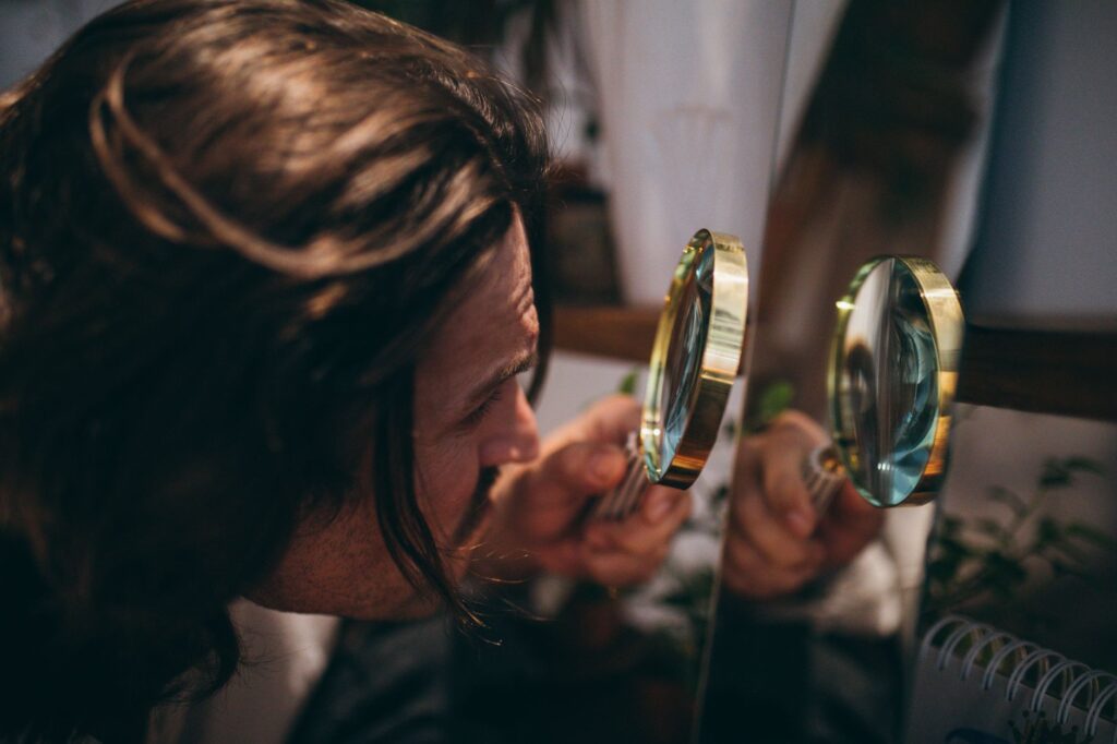
The typographic creation process begins far away from the printed page, at the workbench of a punchcutter. Armed with microscopic files and high-magnification loupes, this artisan carves each letter of the alphabet in relief onto the tip of a tempered steel rod. This original punch, carved with a perfect mirror inversion, is the seed from which the entire typographic family will grow. Mastering this technique demands years of practice, as the human eye must constantly correct optical illusions that occur when transitioning from a drawn stroke to a volumetric metal object.
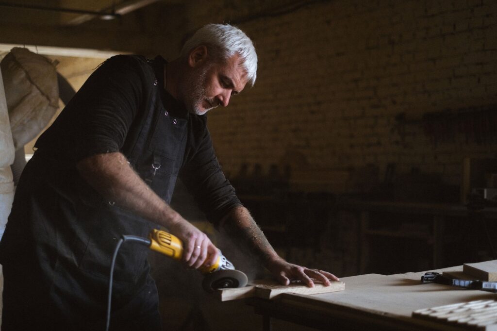
Once the punch is perfected, it is driven into a softer block of copper to generate the strike or matrix. This copper piece is inserted into an adjustable casting mold where molten alloy—traditionally composed of lead, tin, and antimony—is poured. Each component plays a crucial role: lead provides necessary ductility, tin guarantees fluidity during pouring, and antimony ensures the metal expands slightly as it cools, filling every corner of the matrix. The result is a flawless movable type, ready to be arranged letter by letter in the composing stick.
Contemporary workshops facing the digital challenge
Visiting today’s typographic studios in Bologna reveals a fascinating symbiosis between eighteenth-century technology and the demands of contemporary design. Far from ignoring digital tools, modern typographers use vector software to study the proportions and curves of historical typefaces, but they transfer those designs into metal with obsessive fidelity. This hybrid approach attracts independent publishers, visual artists, and designers from around the world who seek to endow their publications with a tactile texture impossible to replicate through digital inkjet printing.
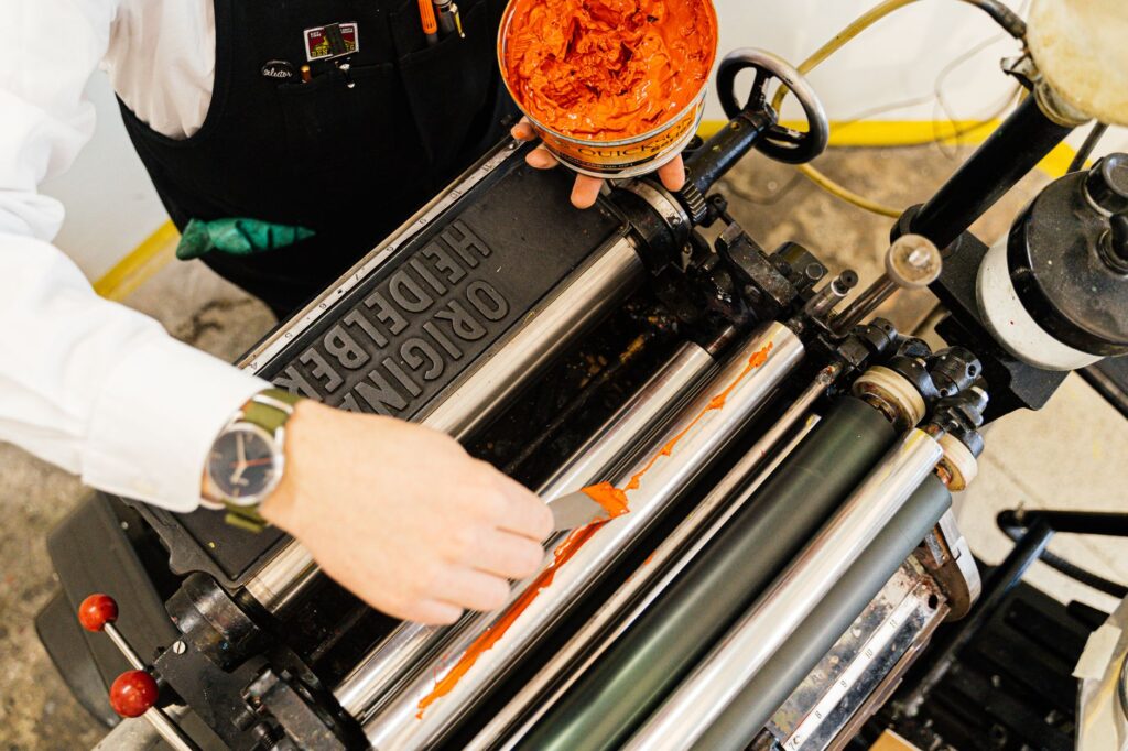
In these workspaces, large Heidelberg machines and manual proofing presses coexist harmoniously with laptops and graphic tablets. Master printers explain that lead offers a physical resistance to paper that digital ink will never possess: the tactile, debossed impression left by metal biting into cotton paper. This sculptural quality has turned books and posters printed using traditional typography into highly coveted collector’s items among bibliophiles and design lovers across Europe and the Americas.
The secret geography of paper and ink in the city
Bologna’s typographic map unfurls far away from conventional tourist routes. It begins in the alleys near the Archiginnasio and extends toward the old artisan quarters. In these corners, small local suppliers continue to produce specialty papers using cotton fibers and rags, following centuries-old recipes that guarantee the durability of the printed work for centuries. The choice of paper is as critical as the casting of the metal; paper that is too rigid will reject the ink, while paper that is too soft will absorb the stroke excessively, blurring the sharpness of the letterforms.
Similarly, the formulation of inks remains an artisanal process in many of these workshops. Mineral pigments are ground by hand on marble slabs with purified linseed oil, adjusting viscosity according to ambient humidity and the workshop’s temperature. This level of absolute control over every variable in the production process turns each print run into an unrepeatable work of art. No two sheets are exactly alike, and that subtle imperfection is precisely the signature of artisanal authenticity in an era of infinite mass production.
Generational handover: teaching the craft against the current
One of the greatest challenges facing Bologna’s foundries and typographic workshops is the transmission of knowledge. Because this knowledge is eminently practical, passed from master to apprentice through observation and constant repetition, the risk of loss is high. However, in recent years an encouraging phenomenon has emerged: young graphic designers from art schools worldwide arrive in Bologna seeking apprenticeships, driven by the need to disconnect from screens and reconnect with matter.
These residencies and training workshops function as talent incubators where students are taught not only mechanical technique, but also the philosophical patience required by manual labor. Learning to set a text by hand—letter by letter and in reverse—forces one to think about language in a radically different way than typing on a word processor. Each word becomes a temporary monument built from fragments of heavy metal.
Lead typography is not a retreat from the future, but a physical reminder that words have weight, occupy space, and demand time to be sculpted.
This renaissance has also spurred the creation of international collaboration networks among workshops in Bologna, Leipzig, Paris, and Barcelona. These platforms share restored historical matrices, organize symposia on graphic heritage conservation, and promote traveling exhibitions that bring this living heritage closer to an increasingly broad and discerning public.

Practical guide
How to get there: Bologna Guglielmo Marconi Airport connects with major European capitals. From the terminal, the Marconi Express monorail connects to Bologna Central Station in under ten minutes.
When to visit: Spring and autumn offer ideal weather for exploring the historic center on foot. Many workshops open their doors to the public during Bologna Design Week and special events such as independent publishing festivals.
Workshop route: Access to most foundries and typographic studios requires prior appointment, as these are active workspaces rather than commercial museums. It is recommended to contact local graphic arts associations to arrange specialized guided tours.
Recommended accommodation: Choosing small design hotels or historic apartments in the Quadrilatero district allows travelers to fully immerse themselves in the city’s traditional atmosphere without sacrificing contemporary comforts.
Readings and resources: To delve deeper into local graphic history, the Archiginnasio Library and the Museo Civico del Risorgimento house exceptional documentary collections regarding Bolognese printing.
Visual epilogue: the weight of memory in our hands
As evening falls over Bologna and the last golden rays of sunlight illuminate the terracotta bricks of the leaning towers, the typographic workshops dim their main lamps. In the dim light, resting on wooden workbenches worn by decades of use, sit the galleys filled with lead organized with surgical precision. A book printed in this manner is not merely a medium for reading; it is a cultural artifact that encapsulates human effort, the memory of materials, and the unwavering conviction that certain things deserve to be printed to endure in a world that is far too ephemeral.